BluSKY Icons
Icon Fonts Screen
Screen Overview
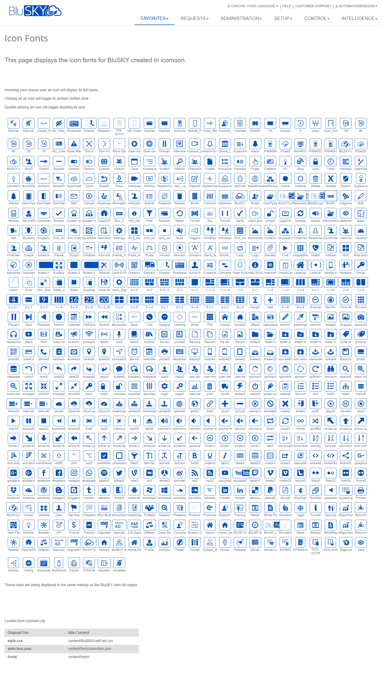
The Icon Fonts screen displays the complete set of BluSKY UI icon fonts created in Icomoon. It provides a visual catalog of all available icons, with interactive previews to test button styling and size. This page is intended for administrators, designers, and developers who select icons for buttons, menus, and view-list pages.
Field Definitions
| Field Label | Definition | Notes |
|---|---|---|
| Page Title | The header identifying the page as “Icon Fonts.” | Read-only. |
| Instruction Text | On-page guidance describing hover, click, and double‑click behaviors for icons. | States: hover to see full name; click to toggle primary button style; double-click to toggle double size. |
| Header Navigation | Global navigation menu across the top (Favorites, Requests, Administration, Setup, Control, Intelligence). | Availability depends on user role and site configuration. |
| Utility Links | Links at the top-right (Choose Your Language, Help, Customer Support, signed-in user). | Read-only shortcuts; not specific to this page’s content. |
| Icon Grid | The main gallery displaying all icons as tiles. | Scrollable list; layout adapts to screen size. |
| Icon Tile | An individual icon preview cell within the grid. | Click and double-click actions apply to the selected tile. |
| Icon Caption (Name) | The icon’s identifier shown with or within the tile; full name also appears on hover. | Use this name when referencing the icon in code or configuration. |
| Tooltip (Full Name) | Hover text that reveals the icon’s full name. | Appears on mouse hover; not shown on touch-only devices. |
| Primary Style Preview | Visual state applied to a tile when clicked to simulate a primary button appearance. | Toggles on/off with each click. |
| Double Size Preview | Enlarged visual state applied when an icon tile is double‑clicked. | Double‑click again to return to normal size. |
| Icomoon Asset: style.css | Reference to the original Icomoon CSS mapped to site path content/BluB0xIconFont.css. | Read-only, informational. |
| Icomoon Asset: selection.json | Reference to Icomoon’s selection.json mapped to content/fonts/selection.json. | Read-only, informational. |
| Icomoon Asset: fonts/ | Reference to the Icomoon fonts directory mapped to content/fonts/. | Read-only, informational. |
| Page Note | Statement that icons are displayed using the same markup as BluSKY view‑list pages. | Helps validate how icons will appear in application lists. |
Screen Actions and Functions
- Hover over an icon – Displays the icon’s full name via tooltip.
- Click an icon – Toggles the primary button style preview for that icon.
- Double‑click an icon – Toggles a double‑size preview for that icon.
- Scroll the grid – Browse all available icons.
Usage Instructions & Examples
How to identify an icon name
- Scroll the grid to locate a candidate icon.
- Hover your mouse over the icon tile.
- Read the tooltip to capture the full icon name.
How to preview an icon as a primary button
- Click the desired icon tile once.
- Review the primary button styling applied to the tile.
- Click the tile again to remove the styling.
How to preview an icon at larger size
- Double‑click the icon tile.
- Confirm the icon appears at double size.
- Double‑click again to return to normal size.
How to reference an icon in markup or configuration
- Identify the icon’s name using the steps above.
- Use that name in your UI configuration or HTML/CSS according to your project’s icon-font convention (for example, within a class or data attribute that maps to the icon font).
- Verify appearance on a view‑list or button where the same markup is used in BluSKY.
How to locate icon font assets for deployment
- Review the “Loaded from icomoon.zip” mappings at the bottom of the page.
- Ensure your environment includes:
- content/BluB0xIconFont.css (from Icomoon style.css)
- content/fonts/selection.json
- content/fonts/ (font files)
- Publish or deploy these assets with your application as required.
System Behaviors and Edge Cases
- Clicking a tile toggles the primary style on that specific tile only; it does not affect other tiles.
- Double‑clicking toggles the size for that tile only; a second double‑click restores the original size.
- Visual previews (primary style and size) are temporary and reset on page refresh or navigation.
- Tooltips require a pointing device; on touch‑only devices the full name may not display.
- The grid may be large; initial rendering can take longer on low‑powered devices.
- Icons are rendered using the same markup as BluSKY view‑list pages, ensuring consistency between preview and in‑app appearance.
Permissions
- Read‑only page; no data is modified.
- Typically accessible to authenticated users with access to UI resources. Specific visibility may be limited by role-based permissions configured by your administrator.
- Navigation items in the header follow each user’s role permissions and site configuration.
Linked Workflows
- Selecting icons for buttons and actions in view‑list pages.
- Verifying icon choices for dashboards, menus, and control panels before configuration changes.
- Referencing asset paths when updating or redeploying the BluSKY icon font package derived from Icomoon.
Reference Image Links